I came across re:dash when searching for an open-source data visualization tool that could connect to many data sources and had strong support for SQL queries. Redash provides a solid dashboard with alerting, built upon the advanced charting of Plot.ly and D3.

Install & Deployment
Though Redash offers hosted options along with scripts for AWS, Docker, and Heroku, I chose to deploy on two Ubuntu 16.04 VMs on Digital Ocean, one for PostgreSQL and one for Redash, Redis, and Nginx.
Following the directions in the Ubuntu bootstrap.sh script were straight-forward, requiring only minor tweaks for a remote PostgreSQL 9.6 databbase.
Data Sources
Redash can query databases such as Oracle, SQL Server, PostgreSQL, and MySQL. Connections to MongoDB, Presto, Vertica, Amazon Redshift, Google BigQuery among others are also available.
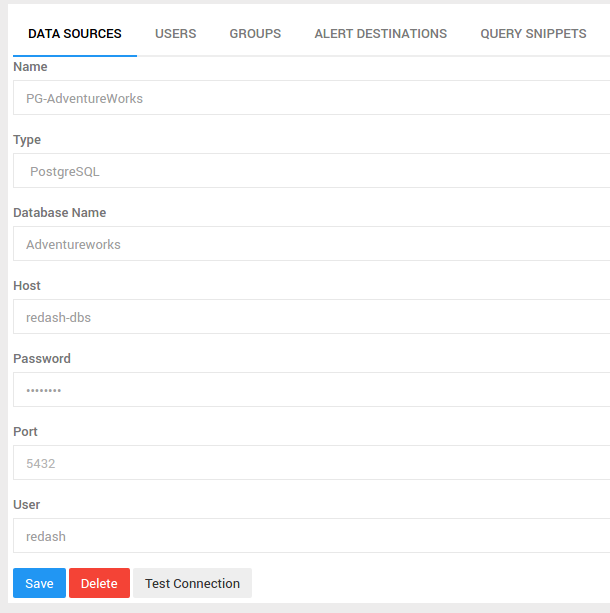
As seen above, creating a PostgreSQL data source is straight forward. I’m connecting to the Adventureworks sample database with sales, staff, and customer data.
Queries
Creating and editing the SQL query is an area where Redash really shines. The query editor has an expandable list of tables and columns that can be drag and dropped into the query box. The Execute button sends the query to the background workers, based on Celery, returning the results in a table below.
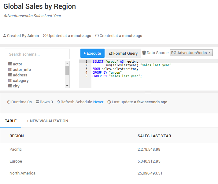
Notice that each query has an owner, last execution time, records found, and a Refresh link.
Query Parameters
Even better, queries can be parameterized in SQL using HTTP query parameters. For example, this query takes a ‘p_Region’ value to narrow the scope via WHERE clause.
Be careful using these parameters in your SQL query to avoid possible SQL injection however.
Charts
Now that we have results, it’s easy to add a chart to visualize the data:
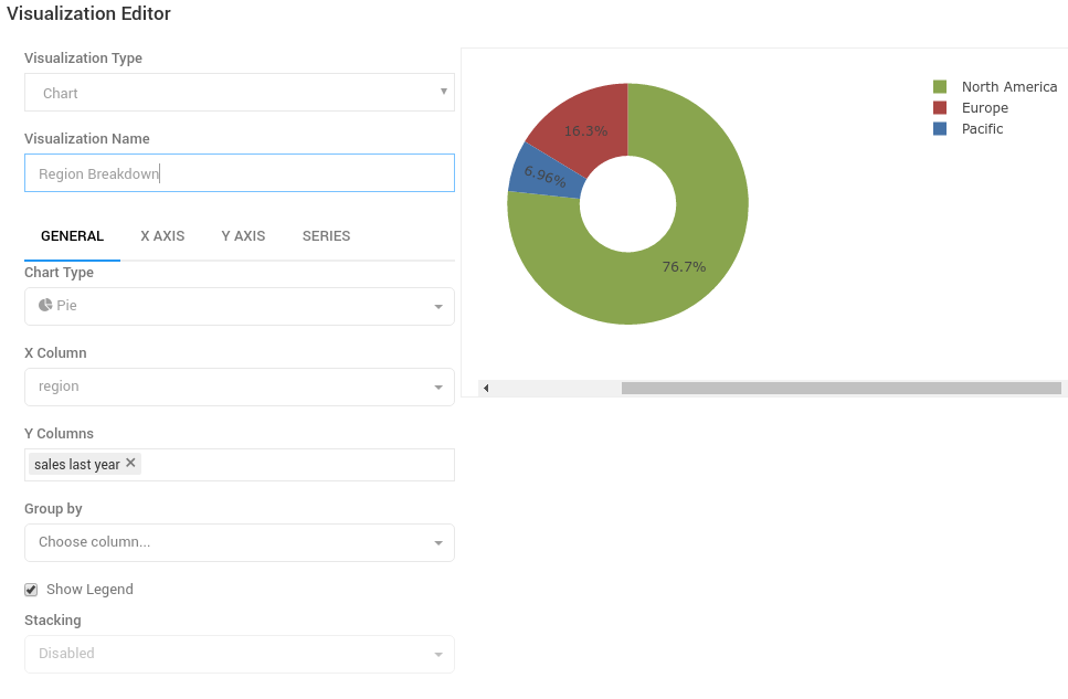
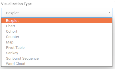
Adding more charts for query results is possible, just by clicking the ‘+NEW VISUALIZATION’ link. Here’s the current choices for chart types:
Dashboards
Once you have queries with visualizations, they can be added to a dashboard, laid out left to right, top to bottom.
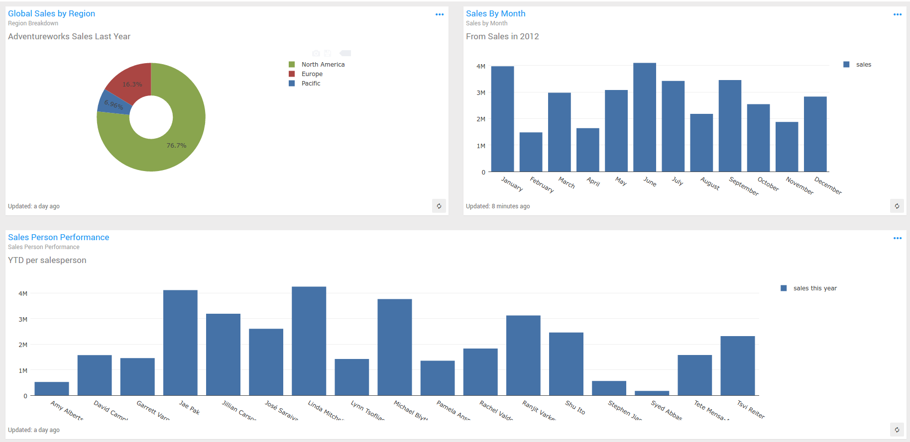
On a wide layout, charts can be regular or double-width. The layout is responsive however, wrapping down right-side charts as the window is narrowed.
Security
Depending on the data being visualized, security can be an overriding concern. Redash offers both authentication and authorization options.
Authentication
Redash by default maintains its own lists of users. For integration with external identity providers, OAuth (for Google anyway) is available. However, unfortunately LDAP (such as Microsoft Active Directory) doesn’t seem to be available yet.
Authorization
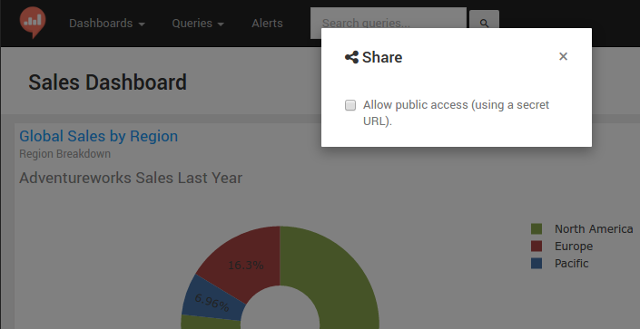
Users can be placed in groups and those groups can be granted access to Data Sources. As well, it is possible to mark a dashboard as public (not requiring authentication) as seen here:
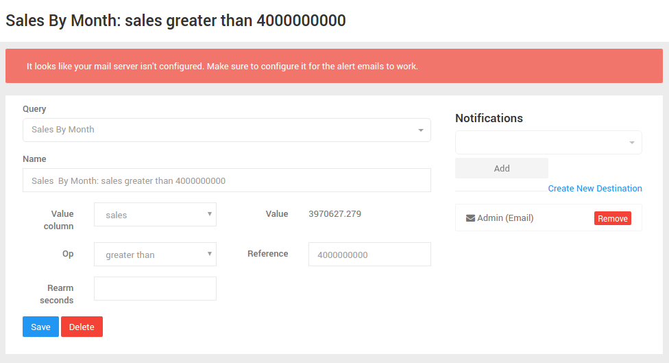
Alerts
Triggers can be placed on queries to alert if a certain condition is met by the results. Notification destinations include email, HipChat, Webhook, and Slack. Here’s an example configuration screen:
Summary
Overall, I’m quite impressed with the fit and finish of this open-source visualization tool. I would definitely recommend re:dash for those needing a quick and powerful solution for data reporting.
Strengths
As discussed above, key strengths of Redash include:
- SQL queries in a web-based editor, with optional scheduled execution.
- Easy to configure charts, maps, plots, and graphs.
- Dashboards which are simple to create and share.
- Configurable alerts delivered via email, HipChat, Webhook, and Slack.
Possible Improvements
As just listed, Redash is already great dashboarding tool. Here are some potential enhancements that could expand it’s usefulness.
Drill-Down Charts
With the support for parameterized queries, it would really nice to see support for chart drill-down. For example, in the pie chart shown above, with a slice showing sales totals per region, it would be nice to click down into a region and see the breakdown of sales in that region, either in a data table or another chart.
Organizing Charts and Queries
Hierarchical organization of the various entities in Redash would also be nice to scale the deployment to many users, across multiple projects and departments. Being able to contain a set of sub-queries or sub-charts “underneath” a parent query or chart would make such dependencies (parameters) explicit.
Alternatively, one could add label/folder support similar to GMail. Barring such an improvement, one could use a prefix naming convention to keep things from getting too cluttered.
Editable Query Results for Quick Fixes
Currently, redash queries results are read-only. This makes sense for most situtations involving straight reporting. However, consider the use of a Redash query as a means of profiling your data for poor quality. In that case, it might make sense to allow authenticated data stewards to make quick fixes against the source data. This is trickier if the data source is staged for reporting and not a true OLTP system. The Redash query refresh feature would be awesome to use after quick edits, immediately showing the improvement in data quality.
Cross Data Source Joins
Being able to correlate and combine records from different data sources before reporting would be a compelling feature. For example, imagine linking sales data together with your shipping department. Basically a simple master data management (MDM) solution with identity resolution and record comparison.
While I am a big fan of MDM, I actually think this enhancement is better done at the data virtualization layer, rather than at the reporting layer. So combining a Redash deployment with Postgres FDW could be a nice approach.
Alternatives
During my research, I looked at the open-source Kibana dashboard, which is an “open core” project where advanced features are unfortunately commerical add-ons. As well, I found Redash’s SQL-based query features to be more compelling.